

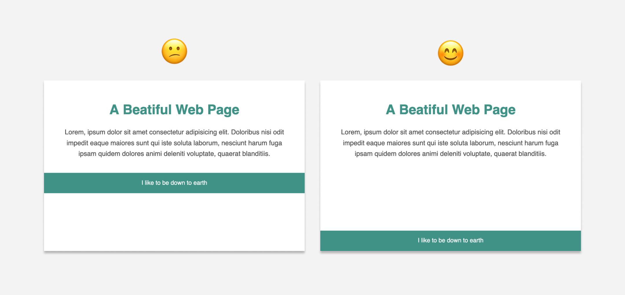
You develop a perfectly looking web page with a nice footer at the bottom, deploy it and send the link to your friend. But guess what? Your friend tells you that the footer is not at the bottom. It’s floating up because your main content is too small to push the footer down on her large screen. Never let that happen again…
So how do you keep the footer at the bottom of the web page no matter how long your viewer’s screen is? We can use either Flexbox or Grid for this. Let’s explore both, and then you can use whichever suits your need.
Here’s the markup first:
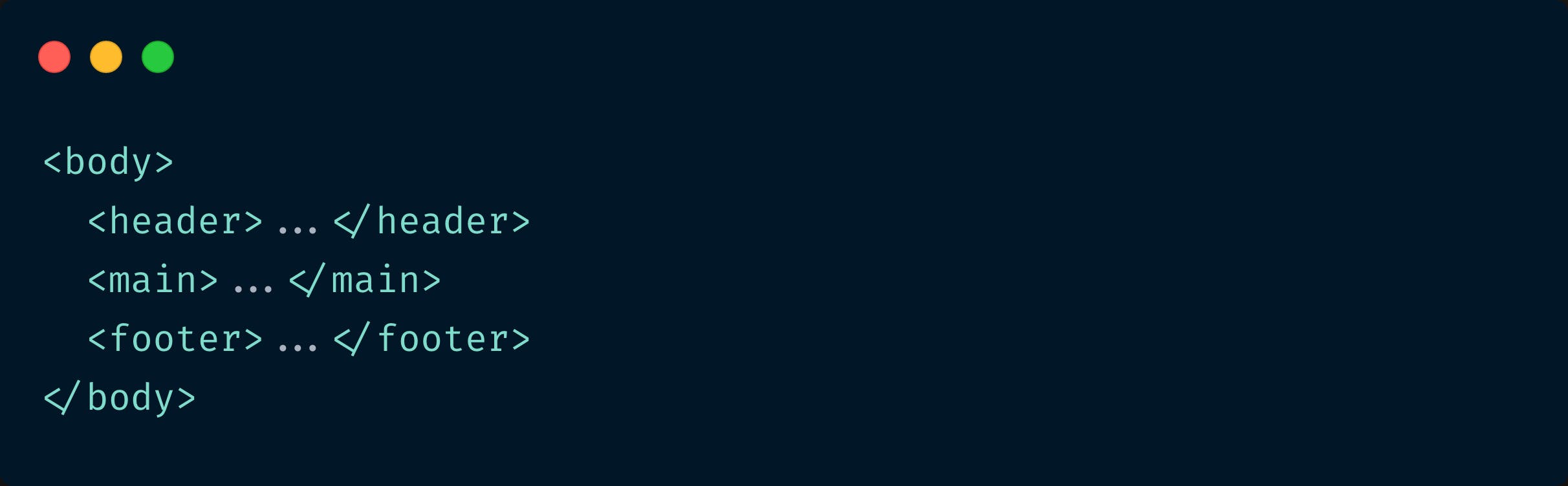
<body>
  <main> ... </main>
  <footer> ... </footer>
</body>
Whichever approach we take, we first need to set the min-height of the body element to 100vh - that is - 100% of the viewport height. Otherwise, nothing else will work.
body {
  min-height: 100vh;
}
The flexbox solution
Since the main and footer elements are direct children of the body, we need to make the body a flex container first and set the flex-direction to column.
body {
  display: flex;
  flex-direction: column;
}
Now that main and footer are flex items, we can use auto margin on footer to push it to the far end (which is the bottom).
footer {
  margin-top: auto;
}
That’s it. This works because when you apply auto margin on a flex item, all the additional space available in the flex container is taken up by the margin. So in our case, all the extra space that was available at the bottom of the page is now taken by the top margin of the footer pushing the footer to the bottom. You can read more about flexbox and auto-margins here.
Check the working demo of this solution using auto margin.
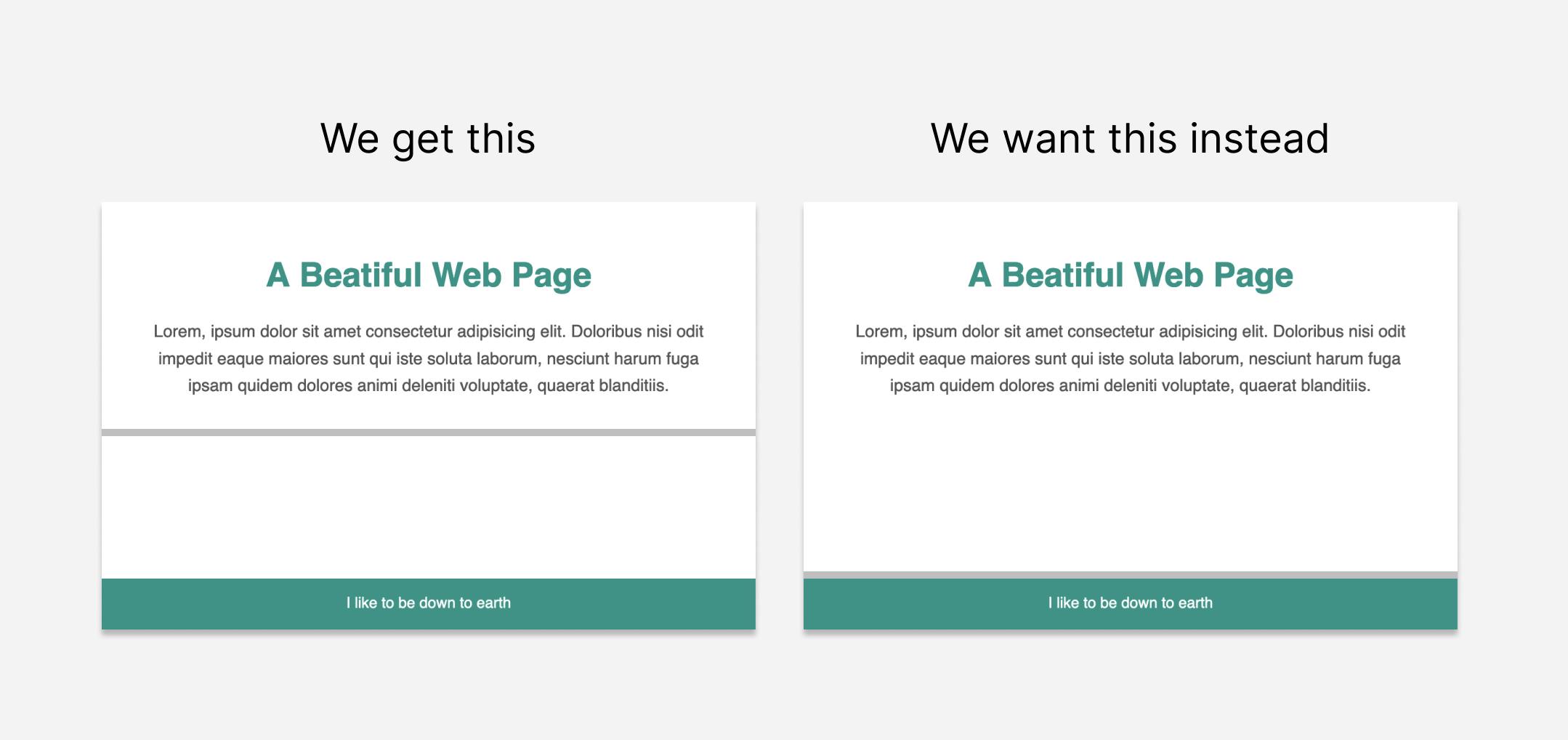
This usually works. It does push the footer to the bottom of the page. But if you want the main section to expand till the footer, the above solution will not help you.
For this to happen, instead of using auto margin on the footer, we can use flex-grow to stretch the main content.
main {
  flex-grow: 1;
}
Check the working demo of this solution using flex-grow.
The grid solution
In case of grid, let’s make body a grid container with two rows - one for main and the other one for footer. Size of the footer row will be auto. And since we want the main element to stretch and occupy all the remaining space, the size will be 1fr.
body {
  display: grid;
  grid-template-rows: 1fr auto:
}
Check the working demo of this grid solution.
Using Flexbox
Pros: You can add any number of sections or elements before or after main within body element directly like this and not be worried about changing the CSS. It still works. That’s not the case with grid.
Cons: More lines of code. And the styles have to be applied to the flex container AND the flex item too.
Using Grid
Pros: Less lines of code. CSS needs to be added only to the grid container (the parent element)
Cons: If you add a header or any element directly within body, you need to change the CSS (the number of grid rows).
Now that you know how each of the solutions work and where to apply them, you can decide which one to use. Hope you enjoyed reading this :)
If you like to receive CSS tips and tutorials like this directly to your inbox every Wednesday, subscribe to my newsletter: CSS Simplified
I am also an author of the eBook Complete Guide to CSS Flex and Grid. More than 1350 people from across 80 countries have bought this book and are loving it! You can download a free sample too.
 Connect to me on Twitter if you have any questions.