Did you know about the ‘display: contents’ CSS rule?
Let’s create a responsive blog post display layout using the lesser known CSS rule `display: contents`


Consider this blog post display section. On a wider screen, we want the image to be on the right separated from the text. While on a mobile screen, we want the image to appear in between our heading and the paragraph.
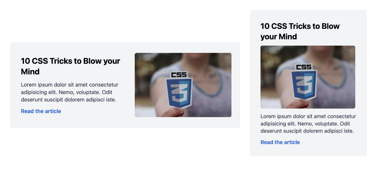
This layout could even be a hero section of your website. There are multiple ways to approach this, based on the HTML markup. Likely, your markup looks something like this:
<div class="container">
  <div class="text">
    <h2>...</h2>
    <p>...</p>
    <a>...</a>
  </div>
  <img.../>
</div>
With this markup, the desktop layout is straight forward. You can use flexbox like this:
.container {
  display: flex;
  align-items: center;
}
But for smaller screens, how do you get that image in between heading and paragraph?
Introducing display: contents CSS rule
When you set use display: contents on an element, that element’s children become direct children of the element’s parent. It’s like, that element disappears from the Markup.
So, in our case, for mobile layout, if we use display: contents on our .text element, it gets ignored. It's now equivalent to:
<div class="container">

    <h2>...</h2>
    <p>...</p>
    <a>...</a>

  <img.../>
</div>
Now we can use flexbox for the .container with flex-direction as column and then use order property to get the image element in between heading and para! 🪄
Here’s the simplified CSS snippet:
.text {
  display: contents; /* Makes the element get ignored */
}
.container {
  display: flex;
  flex-direction: column;
}
h2, img {
  order: -1; /* Makes the heading and image get placed at the top */
}
@media screen and (min-width: 640px) {
  .text {
    display: initial; /* Changing it back to initial value */
  }
  .container {
    flex-direction: row;
    align-items: center;
  }
  h2, img {
    order: 0; /* Default order */
  }
}
You can see the full working demo on Codepen
Hope you learnt something new :)
If you like to receive CSS tips and tutorials like this directly to your inbox every Wednesday, subscribe to my newsletter: CSS Simplified
I am also an author of the eBook Complete Guide to CSS Flex and Grid. More than 1250 people from across 80 countries have bought this book and are loving it! You can download a free sample too.
 Connect to me on Twitter if you have any questions.