

Take a look at this responsive section with a listing of the famous Indian dish Pani Puri. On desktop or wider screens, we want a portrait image (like on the left) while on mobile we prefer a landscape image (like on the right).
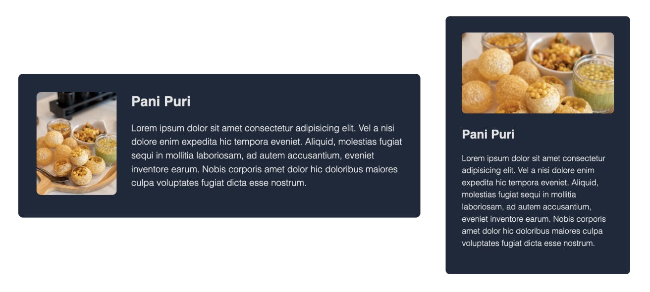
Let’s say, you are given this original image which works fine for the desktop version as it is, but not for the mobile layout:

For this, you don’t need to use any editor to crop the image manually. You also don't have to use separate images for both these layouts. You can use the same image for mobile layout too and specify the width and height as needed. But the moment you set width and height properties like so:
.mobile img {
  width: 18rem;
  height: 10rem;
}
You end up with a distorted image! Aspect ratio lost.

To retain the aspect ratio and show the image as if it was cropped, you can use the object-fit CSS property with the value cover.
.mobile img {
  width: 18rem;
  height: 10rem;
  object-fit: cover;
}
And that’s it! You have the desired result.
By default, the center part of the image gets cropped and displayed. You can change that using the object-position property. For example, if you need the top part of the image, you can use
object-position: top.
Here’s what using different values for this property would give you: center (default), top and bottom

You can read more about object-position from this CSS Tricks article
View the demo of both the layouts on CodePen and play around if you wish to.
If you like to receive CSS tips and tutorials like this directly to your inbox every Wednesday, subscribe to my newsletter: CSS Simplified
I am also an author of the eBook Complete Guide to CSS Flex and Grid. More than 1250 people from across 80 countries have bought this book and are loving it! You can download a free sample too.
Connect to me on Twitter if you have any questions.