8 Simple Tips to make your Website Design look Professional almost instantly
Designing “professional looking” websites from scratch takes experience, but it’s not as difficult as it seems. During the initial days of web design career, I used to compare my design with other websites out there and always felt mine looks amateurish. Clearly it seemed like I would need so many years to take my design to those professional standards considering that I was self-taught. I was wrong.
It just took constant observation and learning. There was a pattern. Of course it did take me a couple of years to fine-tune my designs, learn and apply some UX principles, best practices and so on, but there were some simple things I changed that instantly enhanced my creations. These 8 simple changes to your design will make a lot of difference:
1. Add lot of white space
Observe any good website and you’ll notice that everything seems spaced out. Paddings and margins are used liberally. It’s our normal tendency to want to fill up any empty space. But you need to do the exact opposite. The lesser content there is in one screen, the more focus goes to that content. The users should be able to easily breathe through your content. Add at least 60 pixels of space between two sections, at least 30 pixels of space around images and so on. See the difference for yourself in this below example.
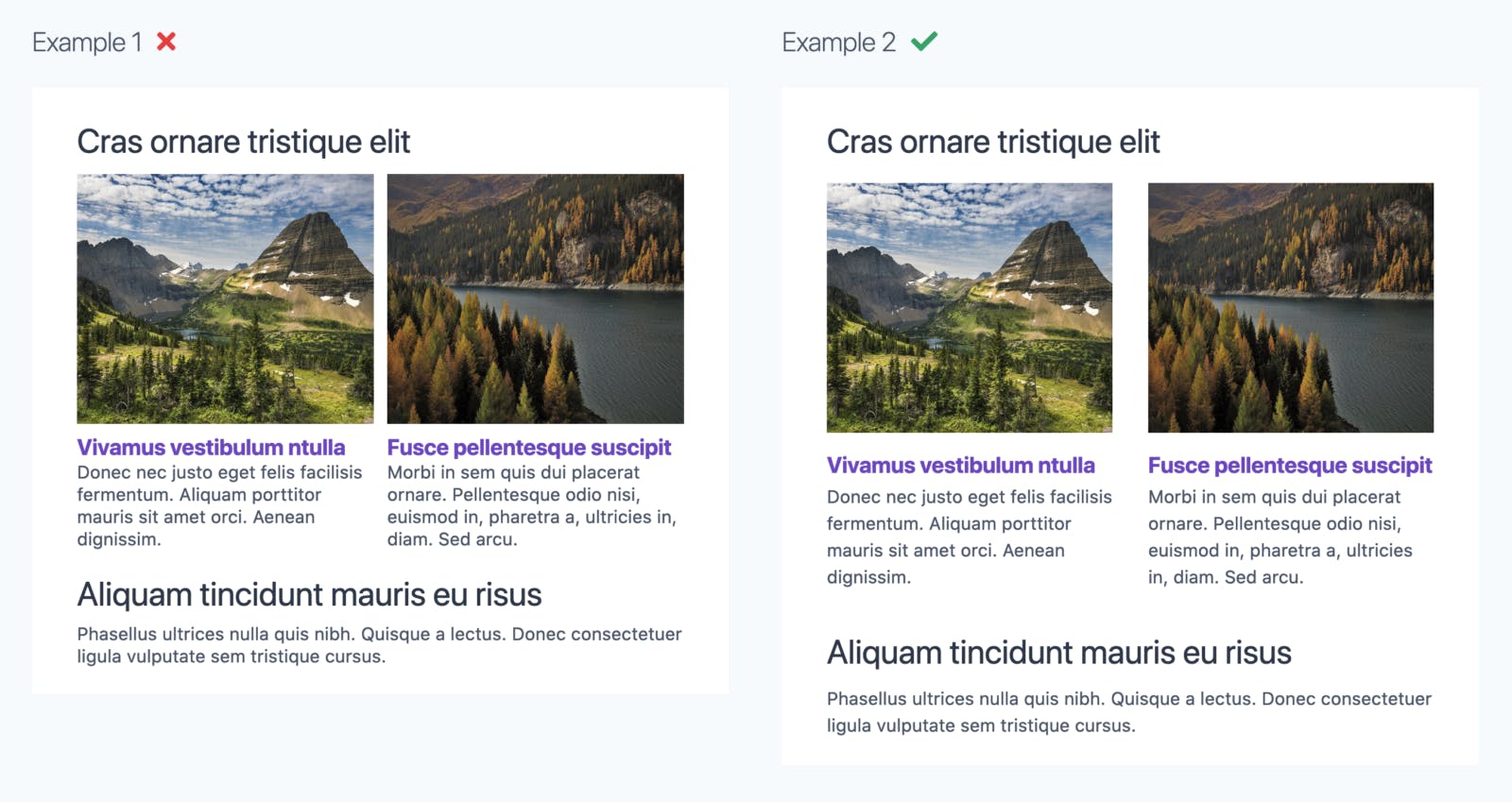
Clearly the one on the right looks more professional. But this alone won’t help, if you don’t follow the next point.
2. Change your text color to a dark gray instead of black
By default, the text color (on a light background) is black (#000). That doesn’t look natural to the eye – it takes too much attention. Change the color of all the black text to a dark gray like #444 or #4B5668 (with a bluish tinge) or #495D44 (with a greenish tinge).

It’s a very subtle difference but your brain picks it up subconsciously!
3. A larger line height for paragraphs
Line height means the vertical spacing between lines of text. The default line height browsers use for rendering text is about 1.2 which is very small. The text looks cramped up, and there’s difficulty in reading. For good readability, any paragraph element should have a line spacing of 1.4 to 1.6. It depends on the font you use. Too much line height is also bad. See this example below.
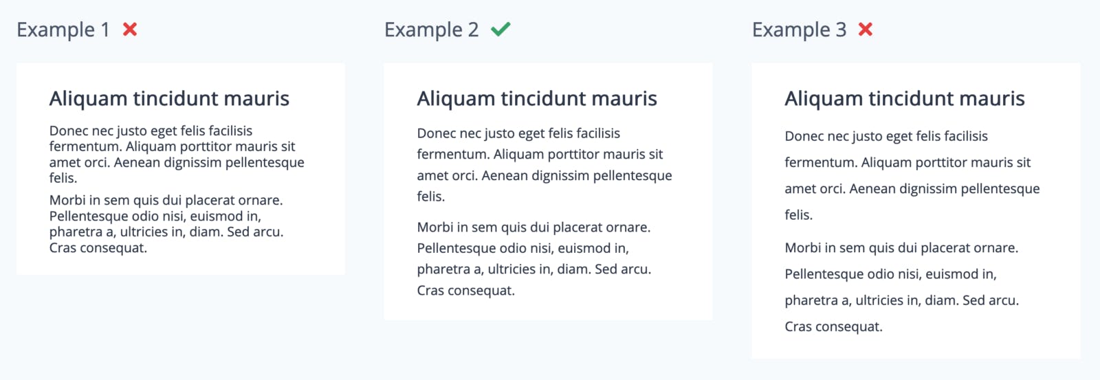
The paragraph in the middle with the CSS property “line-height” set to 1.6 seems perfect for this particular font. (If you’re curious, the font is “Open Sans“)
Remember that the value 1.6 might not be ideal for headings. For larger font sizes, line height of about 1.2 is better. Otherwise the continuity seems to be lost. Refer this one below.
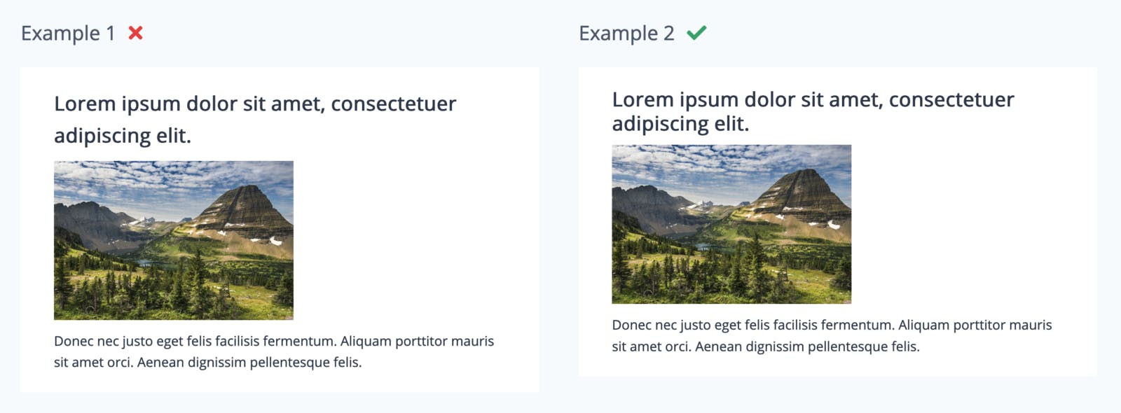
The fastest way to change this on your existing design is to just add line-height of 1.4 or more directly to the “p” element in your CSS file and line height of 1.2 to h1 / h2 elements – so everything is taken care.
4. Use icons wherever possible
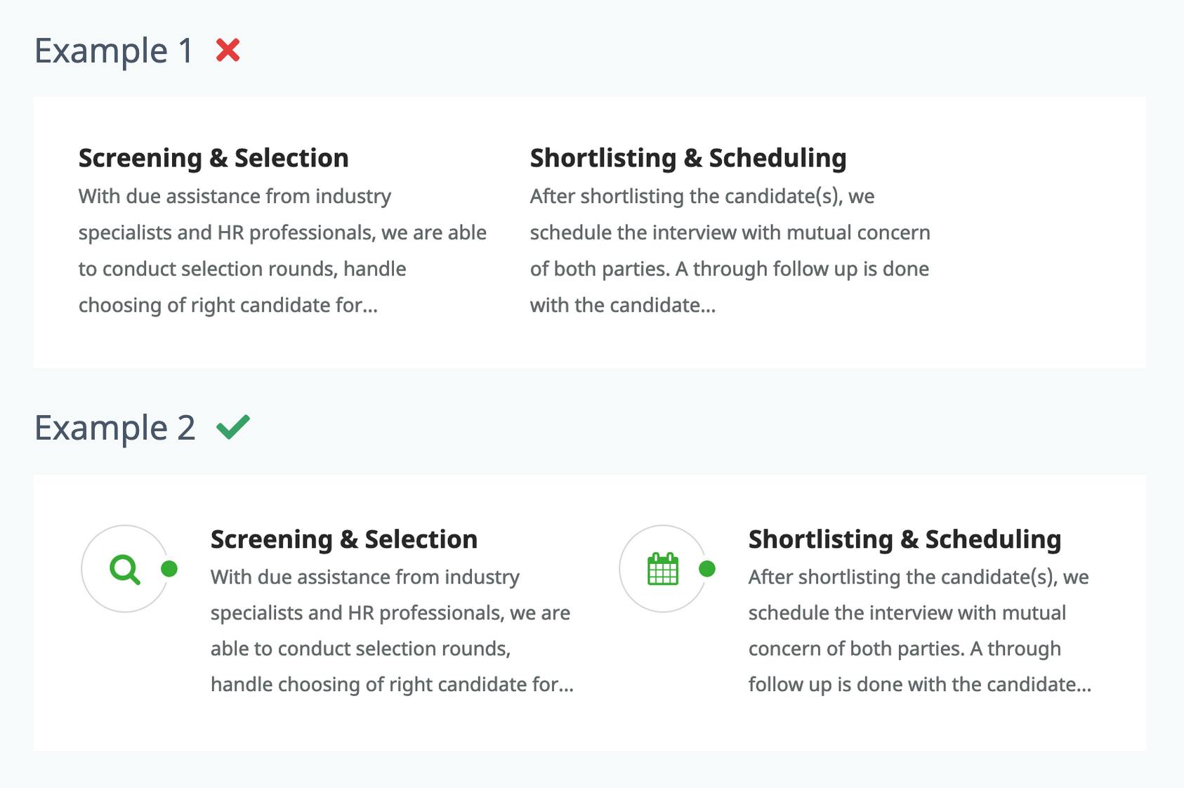
Icons increase readability. A lot of users simply scan the website, before actually reading any content. The presence of icons catch the users attention and help them focus on whatever you are trying to convey through your website. And of course, they add some color to the otherwise monotonous text. Look at the following two examples.
Icons alongside paragraphs of content
Icons with buttons immediately convey what the action is

Which example would you prefer looking at? The answer is simple. And thankfully it’s very easy to add standard icons using ‘Font Awesome‘. It has a huge collection of icons that you can easily use. The best part is, they are scalable to any size you need. So go ahead and add some colorful icons to your pages.
5. Stick to a maximum of 2 fonts
When so many web fonts are available out there and when you can include them using a single line of code, it’s tempting to add too many variation of fonts. Resist the temptation because using more than 2-3 fonts gives an unprofessional look. Preferably use two fonts – one for headings and highlighting important text, and another for majority of the body text. However you can use different font weights to create some more variation.
Having said that, you should also limit the number of font sizes to not more than 4 sizes. Observe different websites and you’ll notice this yourself.
6. Break down continuous flowing text
When a client gives you content for their website, it’s usually some continuous flow of paragraphs. You can’t add them as it is into your page – any section of any page. Just continuous flowing text will make your page look too monotonous, even if you have followed all the other tips above. The users will simply navigate away.
First thing you need to ask yourself is – “Do all of these paragraphs need to go in one single page?” Sometimes the answer could be no, and you can put them where they are appropriate, or you can entirely remove some text if it’s really too much. But if all that is necessary anyway, you can do the following:
- Add images or quotes in between
- Highlight some important phrases differently (larger font size, different color / font weight)
- Break them down under different headings
- Place some paragraphs side by side instead of one below the other with different background colors.
The possibilities are endless. Once you start doing it, and observing other good websites, you’ll get a hang of it.
7. Align elements
This one requires a little more time and effort than the others above. You need to start viewing your web page as a grid, with invisible lines where everything aligns.
- If you have multiple sections on your web page, the text in each section needs to start from the same (imaginary) vertical line.
- If you have paragraphs placed side by side, the lines of text on all paragraphs should align – imagine righting on a ruled notebook.
Observe these in the examples below.
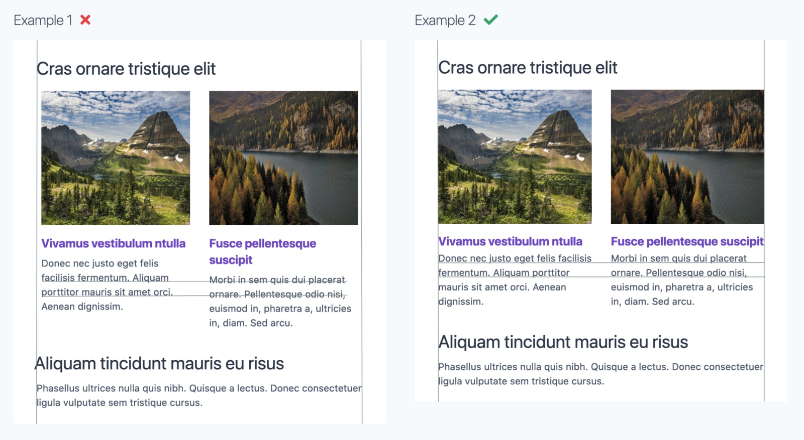 The grid lines are for your reference
- If you have an image next to paragraph, the top of the image needs to align with the top of the text.
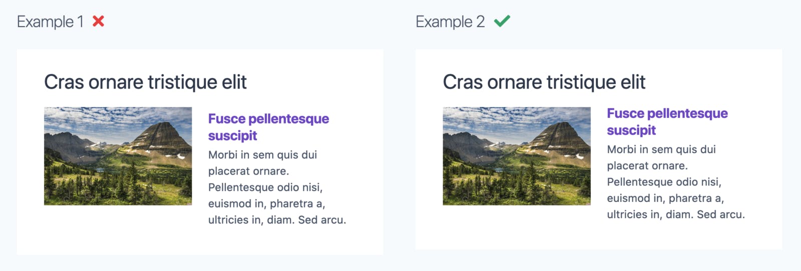
This doesn’t happen by default. Even 2 pixels of a difference gives a feeling that your webpage is cluttered. Fortunately, with frameworks like Bootstrap or Tailwind CSS, using grids in your design is much easier.
8. Stay consistent
Finally, whatever you do – staying consistent is most important! Use the same colors and font sizes for headings on all pages, same fonts for similar kind of text, similar button styles throughout and so on. Also try to use same type of images all over. Some images can’t be too bright and some too subtle.
Follow these tips in all your future designs and slowly it becomes a part of you! Designing or coding isn’t hard, it just takes practice. Once you practice enough, there won’t be a need for you to remind yourself of these because it starts to seem very obvious, and you’ll soon be coaching such stuff to junior web designers.
I would love to hear your experiences or some more tips in the comments below.
