

Text Underline Animation Explained
Let’s look at a simple underline animation on text hover and decode its working


See this text underline animation? Looks really nice right? Let’s go straight into understanding how to create it step-by-step.
The Markup
<p>
  Hover on the link to see the
  <a class="underline" href="#">Underline animation</a>
</p>
The CSS
There are two ways to achieve the animation
Using ::after pseudo-element
In this method we can create a pseudo-element, position it below the link using position: absolute, give it a 2px height and animate the width from 0 to 100%. Something like this:
.underline::after {
  content: "";
  position: absolute;
  height: 2px;
  width: 0;
  left: 0;
  bottom: 0;
  background-color: #088beb;
  transition: width 0.5s ease-in-out;
}

.underline:hover::after {
  width: 100%;
}
And it works! Here’s the working demo.
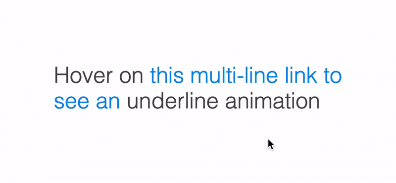
The only problem with this method is that, if the link text flows into next line, the underline appears only on the first line!
Remove display:inline-block on the a element in the above demo and try it out for yourself. So if you need the animation to work on a multi-line text, follow the next method.
Using background property
In this method, we use an underline background image and position it at the bottom of the link. We set the size to 0 width initially and set it to 100% on hover,
For the background image, we don’t need an actual image. We can use linear gradient along with other properties like this.
.underline {
  background-image: linear-gradient(#088beb, #088beb);
  background-size: 100% 2px;
  background-position: left bottom;
  background-repeat: no-repeat;
}
As you can see, we have used the background-image property to set the color of the underline. The background-size property is needed to specify that the image (underline) occupies 100% width and 2px height. The background-position property is used to specify the position and the last line makes the background image not repeat.
If you use the above CSS, you’ll get an underline right away. But we need an underline only on hover. So, let’s change the second line above to:
background-size: 0 2px;
And on hover, we change the background-size to 100% 2px. Also, add some transition. This will be the full CSS:
.underline {
  background-image: linear-gradient(#088beb, #088beb);
  background-size: 0 2px;
  background-position: left bottom;
  background-repeat: no-repeat;
  transition: background-size 0.5s ease-in-out;
}

.underline:hover {
  background-size: 100% 2px;
}
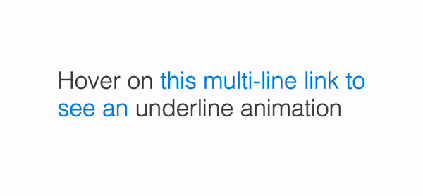
Unlike the previous method, this underline flows into multiple lines. See it for yourself in the working demo.
Bonus
If you want the underline to animate from center instead of left to right, change the
background-positionvalue tocenter bottom.On hover, the line appears from left to right. On leaving the mouse, if you want it to exit to the right like the below demo:
 You need to change the
 background-position to following:
.underline {
  /* Other rules here */
  background-position: right bottom;
}
.underline:hover {
  /* Other rules here */
  background-position: left bottom;
}
If you found the background properties and their values confusing, I encourage you to visit the MDN docs for background-image, background-position and background-size.
That’s a wrap! Hope you learnt something new this week.
If you like to receive CSS tips and tutorials like this directly to your inbox every Wednesday, subscribe to my newsletter: CSS Simplified
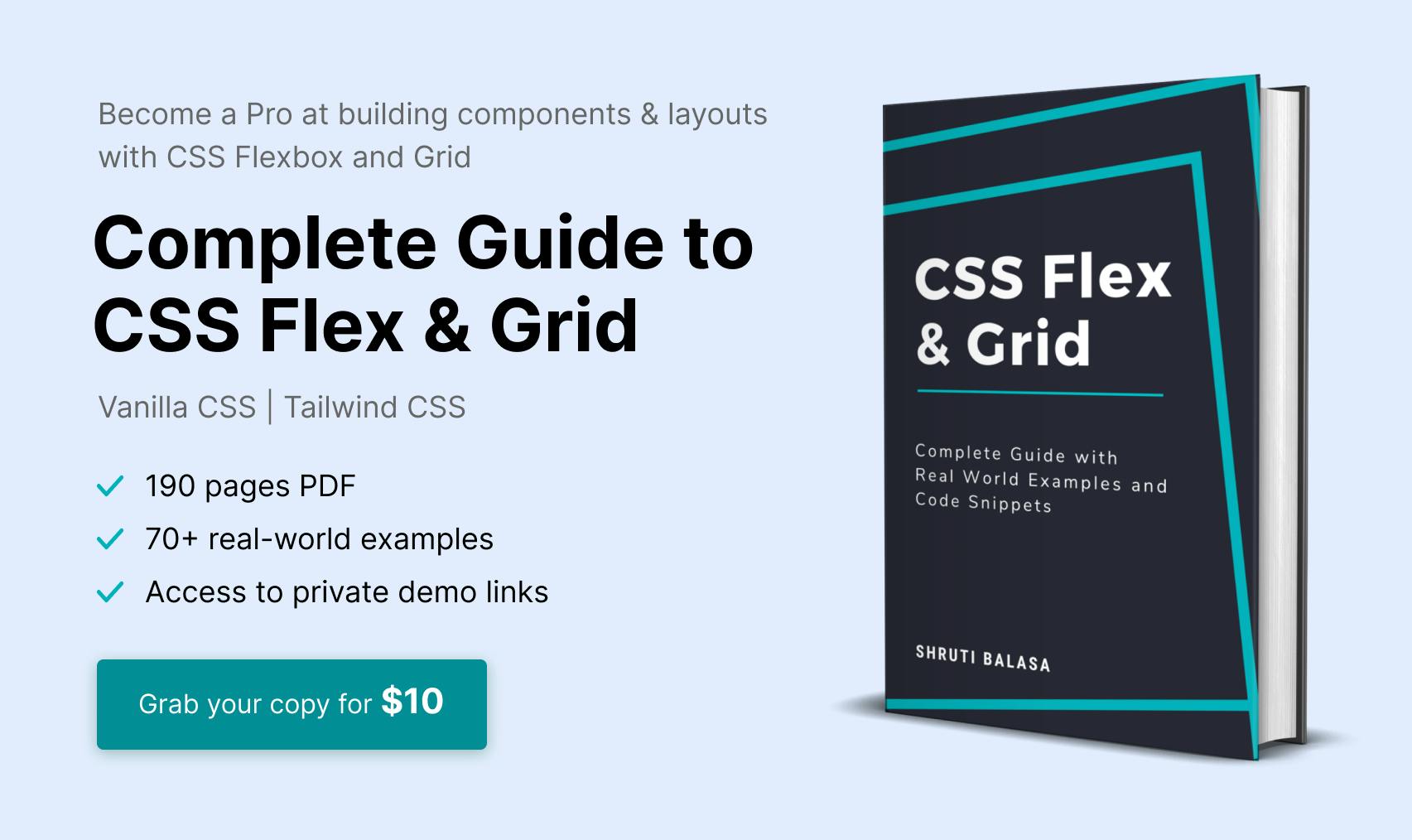
I am also an author of the eBook Complete Guide to CSS Flex and Grid. More than 1250 people from across 80 countries have bought this book and are loving it! You can download a free sample too.
 Connect to me on Twitter if you have any questions.